Discover and create 360° spaces, adding your mark to it!

OBJECTIVE

Identify design opportunities with Outta 1.0 and provide evidence to inform product’s decision-making in building the next version of the product, resulting in increased user acquisition and engagement.

ROLE

As the lead designer/researcher for an augmented reality mobile app (Outta 2.0), I guided the design strategy by providing the product and engineering team with a synthesis of user feedback, actionable design recommendations, and high-fidelity mockups.

  • Defined the user experience of creating and customizing a 360° virtual space in the app
  • Re-designed the onboarding experience and coachmarks to reduce drop-offs 
  • Delivered design specs and assets to app developers in Zeplin

Registration process that balances creating excitement while setting up expectations for the program.

OBJECTIVE

Redesign the registration process to increase onboarding completion rates from 45% to 80%.

ROLE

UI/UX designer for the new version of web registration:

  • Worked closely with the product manager to identify problems with the current flow and new requirements
  • Explored multiple concepts ranging from low-effort to high-effort and evaluated each direction with the team
  • Defined the design principles and a point of view
  • Designed the full flow and communicated design specs and logics with the software engineer
  • Iterated the design in the next revisions

WHY REDESIGN?

With the first version of the web registration design, the intent was to make the process as easy and effortless as possible. However, after the launch of the first few pilots, we noticed that there’s a good number of sign ups for the program, but only less than half of those users complete the onboarding process in the app. That was a big surprise – why are all these people dropping off between registration and the first couple of steps of using the app?

HYPOTHESIS

We collected data from user behavior in Mixpanel, conversations with customer support, as well as qualitative research with those who had gone through the program to identify opportunities for the improvement strategy.

The current web registration process promotes mindless form-filling, resulting in people not knowing what exactly they had signed up for.

Some users are coming into registration directly from campaign emails and don't ever see the website to get more information.

We are accepting everyone in the program, although some users may not be aligned with the demands of the program and therefore drop off.

There's a sense of urgency in having a limited number of seats for registration, but no urgency around the next steps, enabling procrastination.

If we create moments of pause and engagement, users will have a higher chance of understanding what they are signing up for.​

By adding key messages from the website, we make sure that users who don't view the website are not missing out.

If users are clear about what the program is asking of them, they are more likely to participate once they complete registration.

The sooner people onboard, the more likely they are to stick with it, especially if they are committing to starting right away.

DESIGN PRINCIPLES

With the requirements and hypothesis, the next step for me was to create a set of design principles to set the tone and behavior for the flow and functionalities for each step of the registration process.

MEMORABLE MOMENTS

Show users what the program is about (rather than just tell) by creating memorable moments in the process of registration.

EXPECTATIONS

Be explicit about setting up expectations about the program and how it works, to make sure that only those who are aligned sign up.

COMMITMENT

Make it clear that they're only committing to a week in the program. Just give it a try for a week - nothing to be overwhelmed about.

CALL TO ACTION

Communicate what's next and make the call to action clear - download the app and start the program while waiting for the sensor to arrive.

ONBOARDING FLOW

In order to think about the registration flow, I mapped out a user’s experience through the entire journey, starting from marketing materials and program communication, to web registration, and the next touchpoints (including re-engagement campaigns). I wanted to make sure that we are porting the right communication from the earlier stages, and setting up the right expectations for the next steps in the journey.

Previous slide
Next slide

MEMORABLE MOMENTS

It’s easier to understand and remember facts when they are in context, personalized and related to one’s situation. Our program is all about “learning about yourself” and I wanted to bring that to the registration process by calculating people’s answers based on the questions that we ask them in registration –we already do the calculations, however only show them the answers in the app, out of context. It’s easy to surface the same content upfront to create excitement with a lower amount of engineering effort.

BEFORE: Questionnaire without explanation

AFTER: Questionnaire in context, followed by relevant, insightful calculations as a teaser to what's to come in the program

Previous slide
Next slide

EXPECTATION SETTING & COMMITMENT

EXPLORATION

In the first version of the web registration, there was no element of expectation setting. I explored 3 different concepts to introduce “the program” during the registration process, taking into consideration level of engineering effort. 

Concept #1: Small effort

Concept #2: Medium effort

Concept #3: Large effort

FINAL DESIGN

The final outcome was a quiz-like format that used a card to explain each aspect of the program that we wanted to highlight. It’s not really a quiz, because we don’t want anyone to feel intimated by the questions. It’s more intended to cause a “pause” and chunk up the information as part of the question as well as the chosen answers.

CALL TO ACTION

The previous web registration didn’t mention to users what they should be doing next, and relied solely on the following emails to communicate what’s next. I wanted to be as explicit as possible about the fact that “just because you’re done with registration, doesn’t mean you’re all done yet.” That is reflected through the messaging as well as the timeline of the next few days. The primary call to action is to download the app, and the secondary message is to get a sense for when the package will arrive.

OUTCOMES

After spending 3 weeks scoping, designing, building, and debugging, we released an MVP of the redesigned flow. We measured the results and saw that today, 75% of users are completing the onboarding (compared with the original 45%). As we learn more, we keep iterating in small steps to make sure that we can get to at least 80% in the coming sprints ahead.

Daily check-in experience to provide self-reflection and an extra boost of motivation

OBJECTIVE

Introduce a new feature to the app that acts as a “daily check-in” for smokers who have recently quit, to indicate whether or not they have experienced a relapse. The captured information helps health coaches reach out to those in need in a timely manner, helping them stay on track and as a result, increasing our program’s efficacy rates.

ROLE

UI/UX design and user research for creating a new feature in an existing mobile application:

  • Worked closely with product manager and behavior scientist to define the types of information that need to be captured for the coaches
  • Explored different concepts and tested them with smokers and former smokers to identify what matters to them the most and prioritize based on their quitting experiences
  • Created a logic matrix to personalize the experience and add variation to the every day task of checking in
  • Communicated with the iOS and Android engineers on a daily basis and brainstormed new ways to achieve the intention without creating a high engineering lift

FINAL DESIGN

Enabling health coaches to have timely, personalized, and meaningful interactions with their users.

OBJECTIVE

Create the next version of the coaching portal, focusing on increasing the coaching team’s efficiency, by cutting down their time spent on touchpoints with their users, resulting in a reduction of costs for the company.

ROLE

UI/UX designer and researcher on a core team with a dedicated product manager, health coach, and a full stack engineer:

  • Worked closely with the product manager to define requirements by intersecting coaching needs and company goals
  • Consulted with the health coach on a regular basis to validate design directions and set up coach feedback sessions to gain an understanding of underlying needs
  • Collaborated with the full stack engineer to identify feasible paths to achieve design intentions
  • Designed multiple versions of the portal, laying out feature releases on a roadmap, adhering to emerging design principles

Empowering teens to impact the world by earning charitable donations through their safe driving

PROJECT OVERVIEW

Motor vehicle crashes are the leading cause of death for U.S. teens.* Newly licensed teens (16-19 year olds) are 3 times more likely to to be in a fatal crash than drivers ages 20 and over.** There is a lot of potential to make a positive impact by giving teens the right tools and resources to help prevent injuries, reduce insurance collision claims, and most importantly, save lives.

A telematics app was built and released in 2014 with a focus on giving parents the power to monitor their teen’s driving performance and track their location in order to make teens drive safer and to give parents peace of mind. This app was unsuccessful in getting teens to enroll and engage with it.

Our team was brought on to identify the reasons behind this lack of user interest and to redesign the app to increase engagement and adoption. After a rigorous process of talking to teens and parents, understanding pain-points and motivations, prototyping and testing concepts to get their feedback, we proposed a complete redesign of the app which included:

  • creating a new look and feel for the user (teens);
  • incorporating game mechanics to the structure of the app;
  • integrating an incentive system that resonates strongly with teens.

The results of these changes was a significant increase in app registration and engagement.

Motor vehicle crash study sources:

* Centers for Disease Control and Prevention. Web-based Injury Statistics Query and Reporting System (WISQARS) [Online]. (2013). National Center for Injury Prevention and Control, Centers for Disease Control and Prevention (producer).

** U.S. Department of Transportation’s Fatality Analysis Reporting System (FARS).

OBJECTIVE

Redesign an existing mobile application to increase user engagement with the app with the goal of motivating newly licensed teens to drive safer.

MY ROLE

For this project, I was primarily responsible for leading the visual design of the app. The main challenge with the visual design was making sure that the new look and feel of the app remained consistent with the Allstate brand, while also making sure that the app would be viewed as simple, modern, and fun to use for teens.

Visual design deliverables included:

  • Wireframe user flows representing information architecture and interactions.
  • UX overview page illustrating a holistic view of all the MVP screens as well as additional screens and features for the ideal version of the app (future releases).
  • Layout specifications and UI assets for both iOS and Android platforms.

As one of the 4 product designers on this team who are involved in all phases of a given project, I was also involved in conducting user research, ideating concepts, and creating the design strategy for the end-to-end experience of this redesign.

BACKGROUND RESEARCH

We started the redesign project by understanding every aspect of the existing app, including how it worked, the look and feel, the structure and user flows, and studied intentions behind key decisions.

Key findings and opportunity spaces for improvement:

  • Complex and time-consuming enrollment process. The existing app has 5 steps that become a barrier to completing registration and lead to a total of over 80% drop-off. We want to reduce the number of steps in the enrollment process and create a delightful onboarding experience.
  • Non-engaging user experience. The existing app doesn’t look appealing to teens which leads to a lack of a sustainable user engagement with the app. We want to modernize the look and feel of the app and create an engaging user interface.
  • Misidentified end-user. The existing app focuses on teen monitoring and is designed for parents as the end-users which causes parent-teen tension as it is the teens who have to use an app not tailored to their needs. We want to focus the app on teens as the primary users and help them improve their safe driving as the main goal.

USER RESEARCH

We conducted a series of in-depth qualitative interviews with teens (16-17 year olds) and parents of newly licensed teens to get a better sense for what it means for teens to have their own driver’s license, and what their parents feel about this milestone.

Key insights and opportunity spaces:

  • Driving with a license is the first step in a teen’s path towards adulthood. Teens are learning to become independent as for the first time, they get to drive without supervision. Parents are learning to “cut the apron strings” and trust that their teens will make the right choices on their own. We want to support teens and parents during this emotional time by facilitating trust and making this step a safe and positive experience.
  • Teens begin to take an active role in shaping themselves and their impact on the world. At this stage in life, teens transition from being dependent, inward-focused individuals to thinking about the world and what impact they want to have. We want to empower teens to feel that their actions can have an impact on the people and the world around them.
  • Teens grasp immediate feedback and rewards much easier than abstract concepts like accident risk. While teens know that driving fast or dangerously could result in injury or death, the true risk remains abstract unless someone they know is injured or killed. Immediate driving feedback is more relevant and tangible, and immediate payoffs are stronger incentives. We want to utilize immediate feedback and payoffs to encourage safe driving with each drive.
  • Safety of the newly licensed teens overwhelmingly tops parental concerns. Parents are most worried about their teens “making it home safe.” While they are also concerned about what the teens are doing or where they are driving, the most critical thing they care about is whether or not their teen is safe while out driving. We want to improve teen safety and provide parents with the reassurance that their teen has made it safely to their destination.

DESIGN STRATEGY

We want the redesigned app to be a tool that empowers teens to impact the world through their safe actions, and provides parents with peace of mind, knowing their teen is safe, without sacrificing trust between them.

Key proposed features:

  • Shifting focus from contract to empowerment. Remove the parental monitoring aspect of the app and replace it with teen-centered features that respect teens, and create an end-to-end user experience tailored to their needs.
  • Motivating teens to improve their driving. Gamify the structure of the app to introduce levels and driving streaks to motivate teens to pay attention on every drive so that they don’t lose their streak, and level up to incrementally more difficult levels by providing clear goals and a balance between challenge and ability.
  • Rewarding safe driving behavior with charity donations and sweepstakes. Empower teens to feel like their actions impact the world by earning $0.20 charity donation per safe drive. Sustain engagement with the app through a chance to win $25 each month, and help spread the word. Prevent motivating teens to drive too much by counting a maximum of 5 drives per day to reduce chances of getting into accidents.
  • Implementing immediate data-driven feedback. Adjust the scoring algorithm to match safe driving behavior (hard braking, rapid acceleration, time of day) rather than adherence to parent contract (geo-fence, curfew, speed). Provide in-car audio alerts to let teens know when they have an unsafe driving event.
  • Providing parents with peace of mind. Make it easy for teens to let their parents know they have arrived safely through the arrival notifications feature in the app. It can automate texts to be sent from pre-set locations to recipients specified by teens.
  • Simplifying the enrollment process. Remove the Parent-Teen Driving Agreement sections that relate to the contract, and create a simple onboarding process that is within the app itself, reducing the number of steps to getting enrolled.
  • Creating a social platform for competition and interaction with peers. Encourage teens to compete on donations earned and provide a fun and light-hearted element to keep teens engaged.


DESIGN EXPLORATION

With a design objective of modernizing the visual design of relevant screens from the existing app and creating new screens to include the key proposed features, I began to create an app-spirations page, followed by wireframes and mockups to start exploring the look and feel of the redesign.

design-exploration2-01

Once we got a good sense for the overall changes to the structure of the app, I tackled the Home screen layout and visuals. The example below illustrates the method of communicating design decisions to the larger team, which includes call-outs and flowcharts.

design-exploration5-01

Once the overall structure of the Home screen and its relationship to other screens was approved, it was time to tackle the details of the visual design. After numerous iterations, the final redesign had a simple, clean, and modern look while staying consistent with the Allstate brand.

design-exploration4-01

With the finalization of all screen visuals, the interactions between them was laid out to better understand navigation between them.

design-exploration6-01


FINAL DESIGN

The final design of the app encompasses the key features that were identified based on our initial research.

DELIVERABLES

The final design was made for iOS and Android platforms. For the purposes of the market test, MVP documents were created that were limited versions of the ideal designs. The following deliverables were provided to the engineers for developing the application.

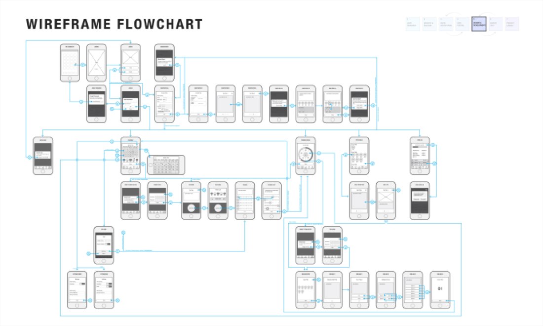
The wireframe flowchart shows the relationships between screens, and outlines parts of the app that only happen once (such as registration process or setting up arrival notifications for the first time).

sd-flowchart-01The UX overview represents all the final screens organized by their function for reference.

sd-ux-overview2-01

The layout of each screen was specified for both iOS (2x for iPhone 5, 6, 6+) and Android (MDPI) platforms and UI assets were provided to developers.

MARKET TEST

For the market test, our team worked closely with the product owner, project manager, architects, developers, and business strategists in a cross-functional team to test different aspects of the redesigned app.

Testing key areas of focus:

  • Gauging appeal of the app from teens
  • Measuring engagement and usability
  • Measuring improvement in teen driving behavior
  • Assessing business value
  • Determining go-to-market strategy for the countrywide launch

Method:

  • Conduct an in-market test with at least 200 active users
  • Analyze survey results for user feedback
  • Analyze metrics recorded in the app

Recruitment Strategy:

  • Connect and partner with 8 schools in 4 states to promote the app
  • Utilize agents to go out to 3 schools
  • Attend We Day with a booth and attract teens to download the app
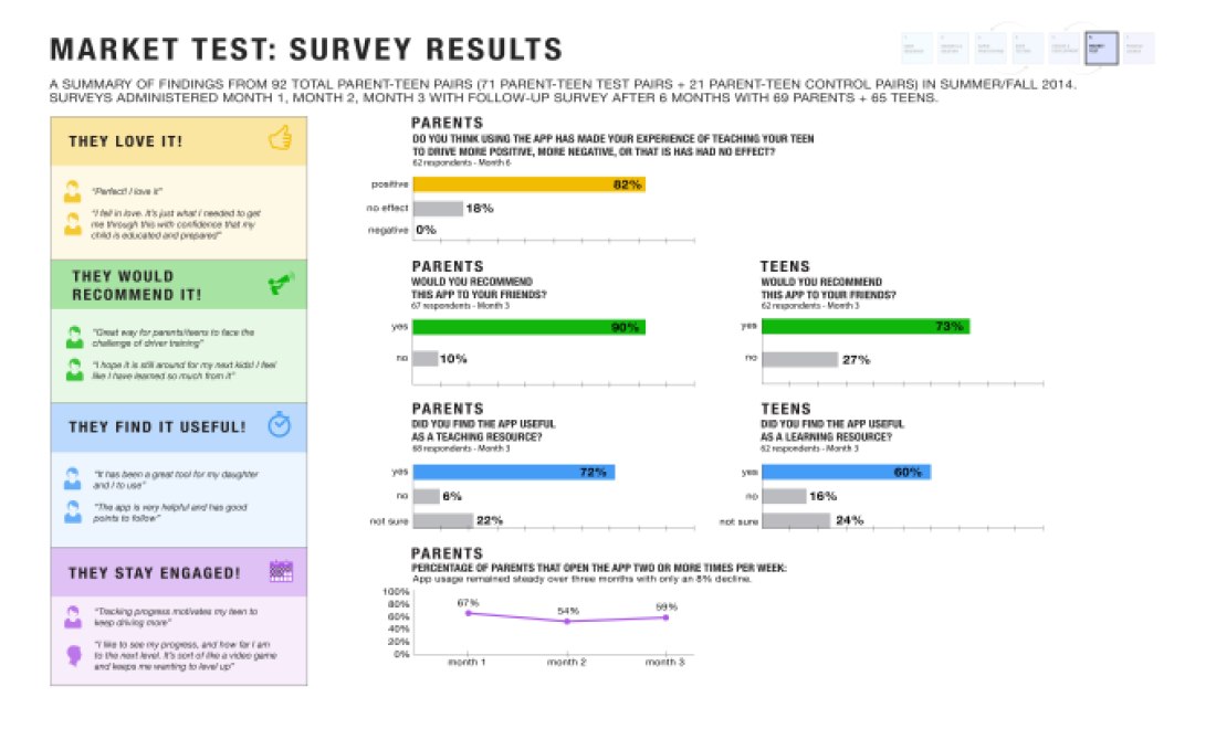
Results:

The app was tested with 468 users from 4 states. We received a total 101 survey respondents.

  • 86% of survey respondents said they “like very much” or “like” the overall app.
  • 75% of respondents would be “extremely likely” or “very likely” to recommend this app to their friends.
  • 94% of respondents rated they “like very much” or “like” earning charitable donations by driving safely.
  • 83% of respondents found that the amount of money they earned for charity was sufficient to make driving safely worthwhile.
  • 88% of respondents said that Free the Children was a charity that they cared about.
  • 79% of respondents found the driving streaks motivating to drive safely and said they tried to beat past scores.
  • 86% of respondents felt that the app had a positive impact on their driving behavior and helped them understand which driving skills they needed to improve.
  • 77% of respondents, all of whom had been in the program for at least four weeks, said they were still using this app when they drive.
  • 73% of respondents liked the reminders to let their parents know they arrived safely.
  • 70% of respondents also liked that their parents did not have access to their driving information.